G–L–O–B–U–S Brand Identity Александр Ревяко
Category
Branding and Communication Design
Nominations
Logo
Link
This work
in other
nominations
Brand Identity
Task
To design a brand identity for the young B2B framework. And map out a route from a service to a brand
Ideas and solutions
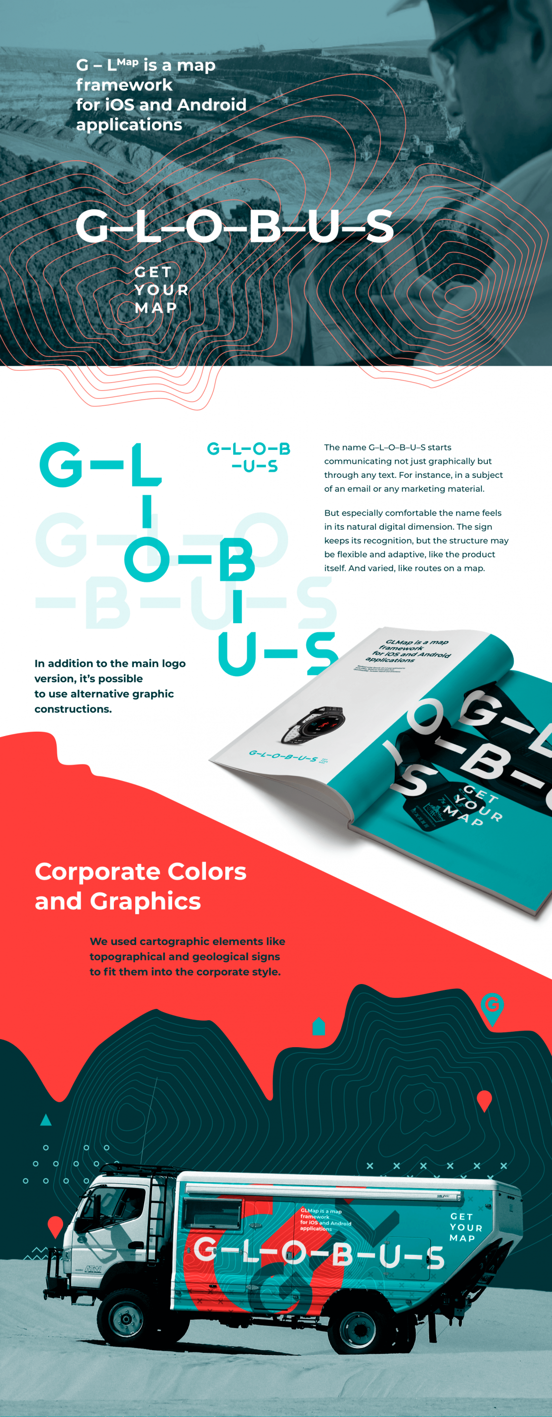
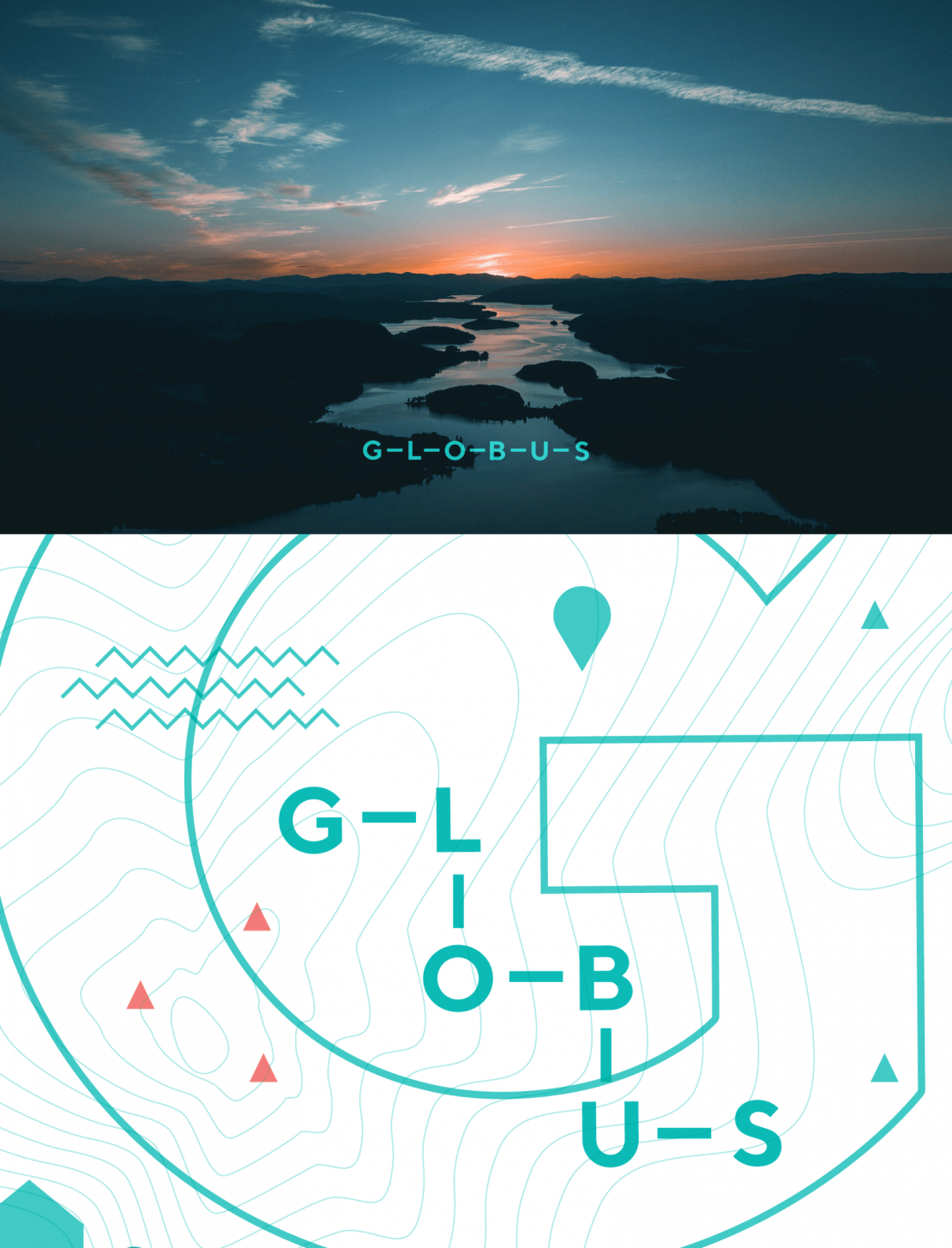
Many products with the same name make the branding really challenging, but we are not allowed to change the name. So we made an alternative route to stand out — a visual one. The letters are turning into pins on a map because you can travel not only from point A to point B. The name G–L–O–B–U–S starts communicating not just graphically but through any text. For instance, in the subject of an email or any marketing material. But especially comfortable the name feels in its natural digital dimension. The sign keeps its recognition, but the structure may be flexible and adaptive, like the product itself. And varied, like routes on a map.


