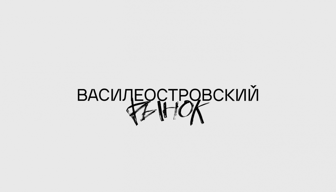
Vasileostrovsky Market Логомашина
Task
Our main task was to develop a corporate identity that meets the current trends of modern urban spaces, taking into account the specifics of the project and its location
Ideas and solutions
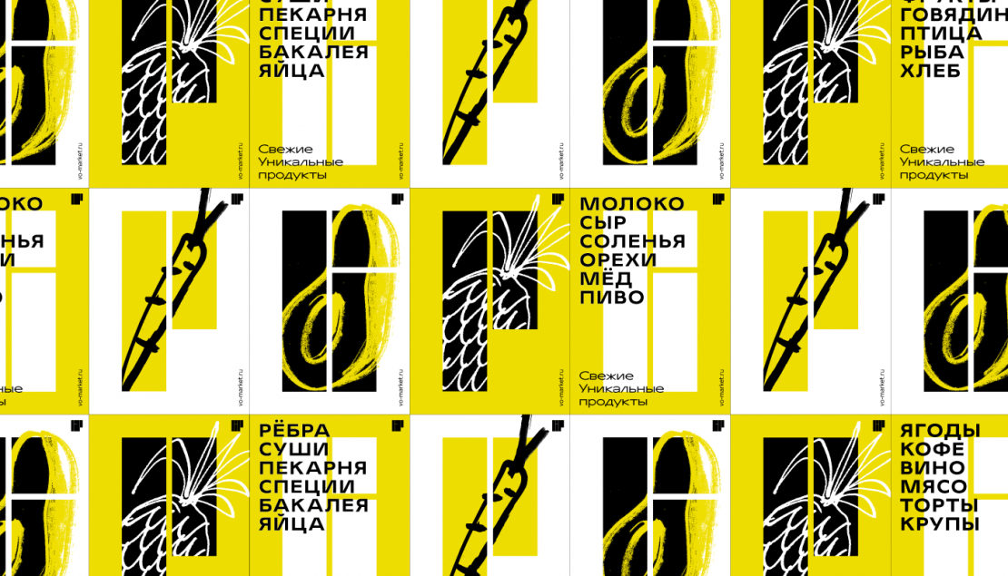
The lines of Vasilievsky island are very geometric, it is a recognizable pattern for the residents of St. Petersburg. That's why we used this memorable element for the logotype. The blocks were added to the cyrillic letters "VR" (which are the first letters of Vasileostrovsky Market in Russian). The letters in the logo are blocks, they support the concept of the main sign. The manual inscription "market" – is a direct reference to the Soviet signs. A checkmark in the "Y" (cyrillic letter in Russian) — is a symbol of a Seagull that circles over the Vasileostrovsky island in any weather. In the graphic part, there are a lot of fruits and vegetables. They become heroes of the Vasileostrovsky Market: meet guests, help to navigate customers, convey the mood