Crunchy Crew Креативное Агентство GreenMars
This work
in other
nominations
Brand Identity
Task
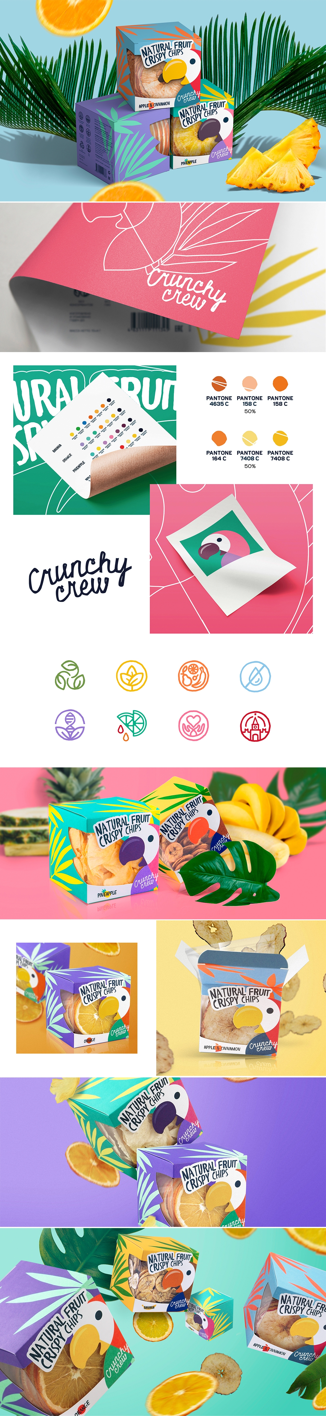
Organic fruit chips are far from being the most ordinary and common products. However, there is already quite a heavy competition on the market. Our task was to create a unique brand that would help to reveal all the advantages of the product to a Customer. They differ from our competitor’s products by the incredibly thin slicing carried out in a manual way, as well as by rich taste and loud crunch. All these values needed to be revealed in the product branding and packaging design.
Ideas and solutions
Beginning our work on the project, first of all we tasted the range of our Customers’ products such as pineapple, orange, apple and banana chips. Having crunched with the chips to our heart’s content and having gone through hundreds of variants, we came up with the catchy name Crunchy Crew that one would easily remember. After that, we moved to the ideas of packages. Apart from making them appealing, we needed to solve some technological problems. First, we had to ensure the preservation of finished products during their transportation. Secondly, we were supposed to demonstrate the product from several perspectives so that a beautiful external view and the thin slicing would be visible to the customers. Third, we were to remain within the limited price of producing packages. In order to implement this, we suggested the variant with the hard cubic-shaped box having a transparent window on at least two sides of the package. This design will allow our customers to see the product, evaluate the thickness and the quality of chips. The concept suggested by us is based on bright colours and a cheerful main character. Macaw parrot together with a rainforest evoke a direct association with fresh tropical fruits. To make the idea suit various tastes, we developed a scheme based on Pantone colours. For the informative part of the package we have created a bright infographics that visually demonstrates all the advantages of the product. The background color and the color of a parrot may vary depending on the type of fruit.The material of the package has a texture; the relief stamping evokes a pleasant tactile sensation. The developed Crunchy Crew brand is notable for its special character and for the ease of perception. Delicious and healthy snacks in the original packaging attract the attention of a wide range of customers. Products are presented in retail chains and eco-stores.