BIG TABLES Денисова Екатерина
This work
in other
nominations
Brand Identity
Task
Develop identity for a carpentry shop specialising in producing large tables for studios and offices
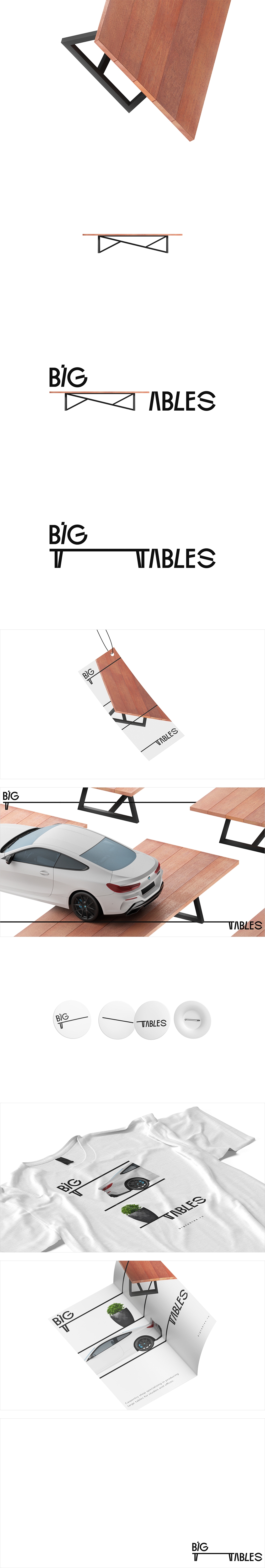
Ideas and solutions
This is not your regular carpentry shop. This is a company that builds only tables — really, really big ones. And this is why we named them plain and simple, BIG TABLES. This is a very practical name that sets the brand apart and cleverly highlights its unique area of expertise. And thus, the name started the subsequent branding. The logo was inspired by the shape-shifting letter T that looks like a table and is also the first letter of the word, 'Table'. By stretching the T, we made a big table out of it, and put the word BIG atop of it, as a testament to the table's strength and versatility. The logo, then, became the embodiment of the brand. The slant type was made to resemble the individual wooden planks of the table, and the final letter S is actually a Screw that holds the whole Table together. Geometry and Hyperbole are the two elements of the identity where everything is 'at the right angle', and the bigness and versatility of the tables are playfully depicted in humorous communications