Career site for swtecnn Nikita Belov
Task
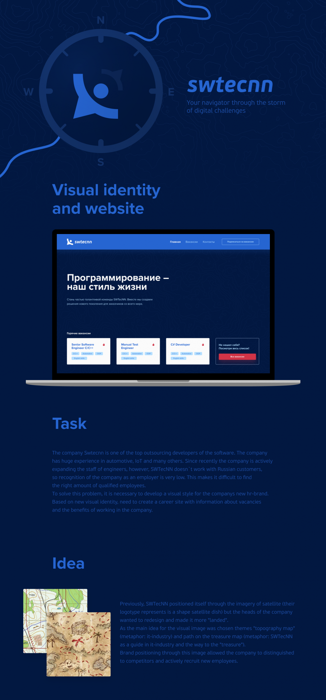
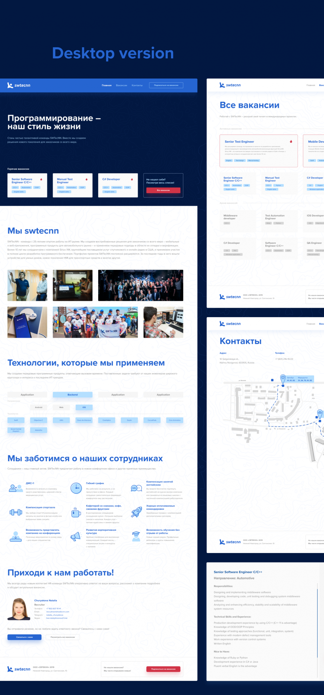
The company SWTecNN is one of the top outsourcing developers of the software. The company has huge experience in automotive, IoT and many others. Since recently the company is actively expanding the staff of engineers, however, SWTecNN doesn`t work with Russian customers, so recognition of the company as an employer is very low. This makes it difficult to find the right amount of qualified employees. To solve this problem, it is necessary to develop a visual style for the company`s new hr-brand
Ideas and solutions
Previously, SWTecNN positioned itself through the imagery of satellite (their logotype represents is a shape satellite dish) but the heads of the company wanted to redesign and made it more "landed". As the main idea for the visual image was chosen themes "topography map" (metaphor: it-industry) and path on the treasure map (metaphor: SWTecNN as a guide in it-industry and the way to the "treasure") Brand positioning through this image allowed the company to distinguished to competitors and actively recruit new employees. You can see the final result on behance (https://www.behance.net/gallery/81349355/SWTecNN-Career-Site) or by following the link to the career site (https://career.swtecnn.com)


