The Krasnaya Gorka museum-reserve PetrogradWeb
This work
in other
nominations
Illustration
Task
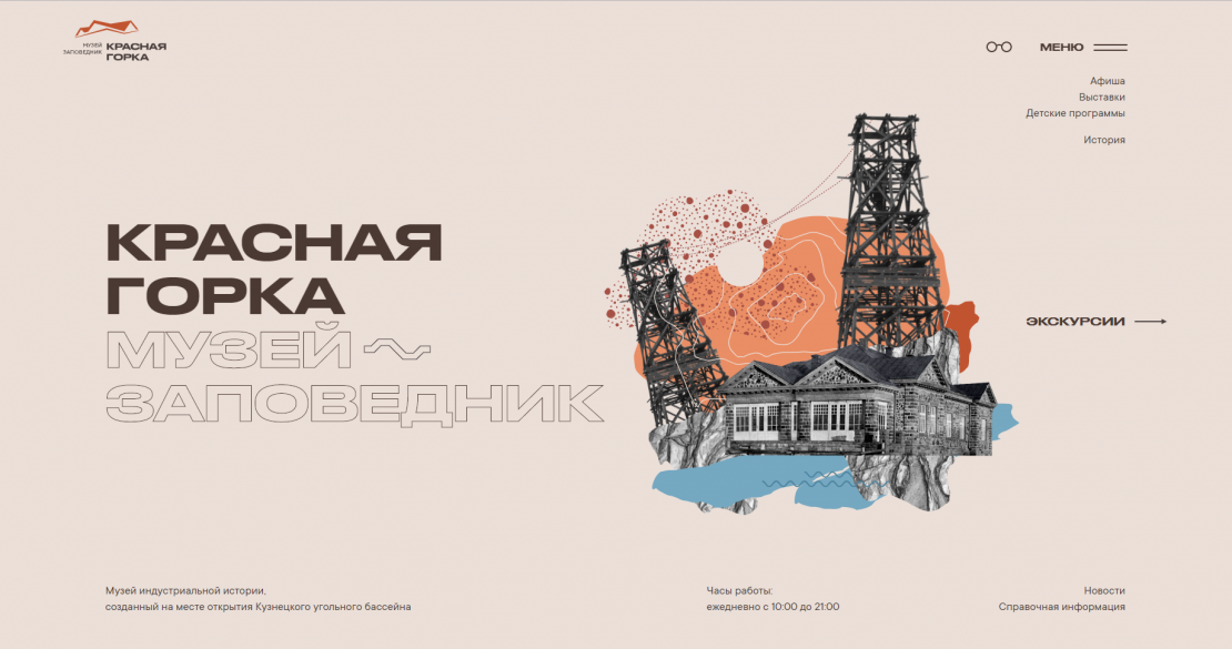
Develop a website for the state museum that will increase interest in museum exhibits and its history. At the same time, it is important to maintain the fundamental character of the state object and not to go into an entertainment format
Ideas and solutions
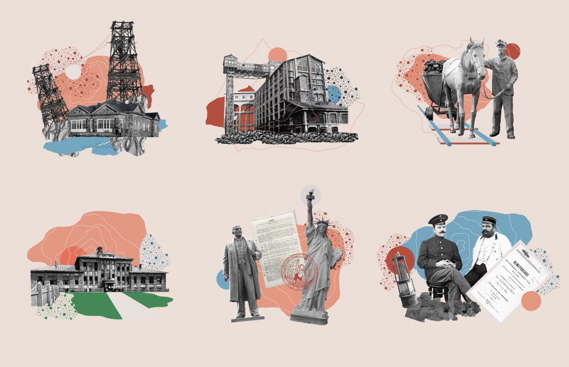
We conceived the site in colors close to Soviet posters to reflect the mood of that time. The heading font we took is recognizable and memorable, but not universally used. To attract a younger and more creative audience to the museum website, we have developed a number of collage illustrations. We partly relied on the style of pop art, albeit a little later, but conveying some of the spirit of that time. Site navigation is concentrated in a burger menu with highlighting key sections. It is important to note the elaboration of the pages of "long reader", where a huge amount of information (textual and illustrative) had to fit on one page, for example, https://redhill-kemerovo.ru/istoriya/stati/aik-kuzbass/ (as the main points: introduced chapter navigation, using the space on the right and in the text for photo-illustrative material, special blocks have been introduced with personalities that refer to certain sections, but which give an originally hidden photo of a person and a brief annotation)


