Nevsky Bereg Hotels PetrogradWeb
Task
1. Increase sales directly from the site 2. Updating the site, taking into account rebranding - the corporate identity has changed, the number of rooms is being gradually renovated
Ideas and solutions
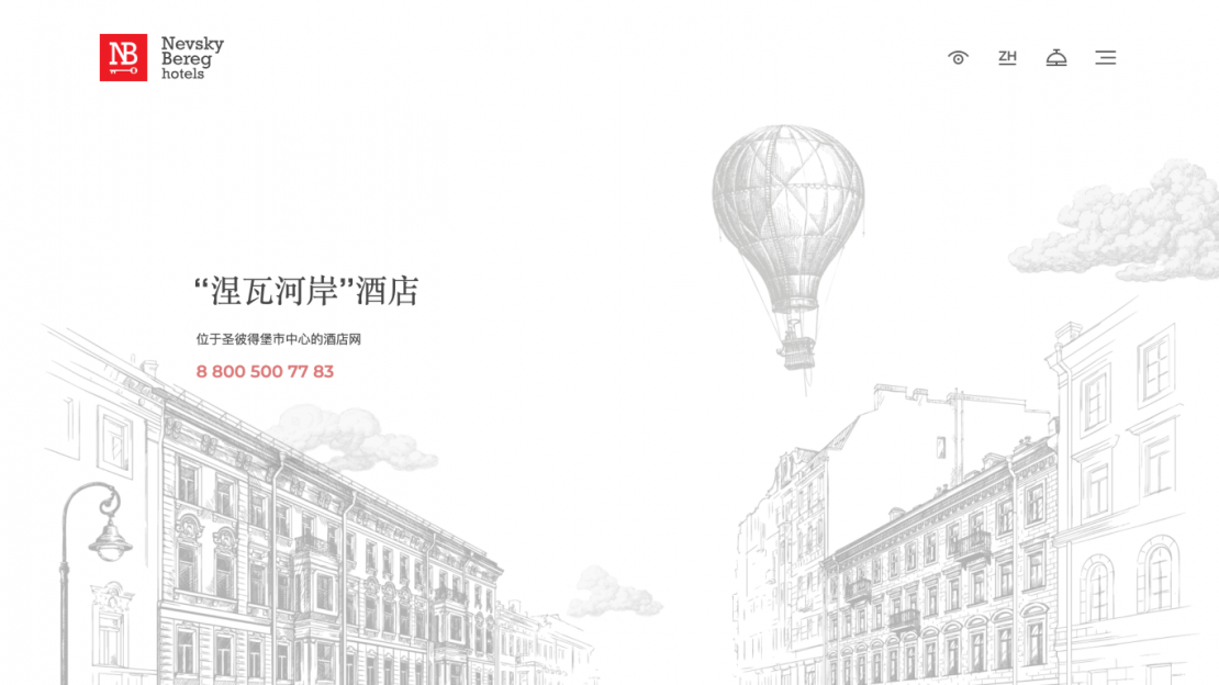
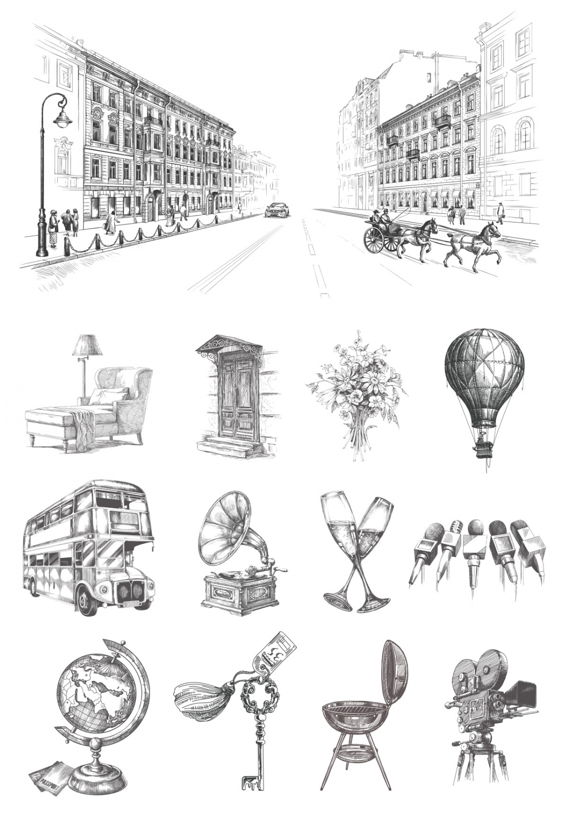
Hotels Nevsky Bereg - two historical buildings in the center of St. Petersburg, located opposite each other across Nevsky Prospect, a couple of minutes from Moskovsky Railway Station. The positioning of the hotel is based on the fact that these are historical buildings with their own warm, lamp atmosphere, and when arriving here, the visitor can touch the history of St. Petersburg (the whole center is within walking distance). In the business season, emphasis is placed on location and transport accessibility. To convey the lamp-like character of the hotel and to emphasize the historical significance of the place, we suggested that the client involve an engraving artist to draw their hotels and prepare illustrations for all pages of the site. The client liked the idea, and we, finding an illustrator specializing in this style, prepared the main illustration - two hotels on Nevsky Prospekt. When rendering, we used both historical messages (such as a horse harness, people in historical dresses, a balloon), and elements of our time (a car, passers-by in modern clothes). After that, illustrations were drawn for each section / page. The client liked the embodiment of the idea even more, and now they use these illustrations in their POS materials and interiors (we assumed this, therefore all the illustrations were drawn in a vector). In design, the emphasis is on simplicity and lightness. Also, to give historical significance and emphasis on location, we added an engraving of a map of the center of St. Petersburg with an indication of the main attractions and hotels. Based on analytics by the hotel’s audience, five additional language versions of the site were selected. In the context of the Chinese site, the illustrations opened in a slightly different light, reminiscent of Chinese painting with calligraphy. After updating the site, its conversion increased, increasing the turnover of orders from the site 2.7 times compared to last year with the same volume of traffic

