Different Lab Креативное Агентство GreenMars
This work
in other
nominations
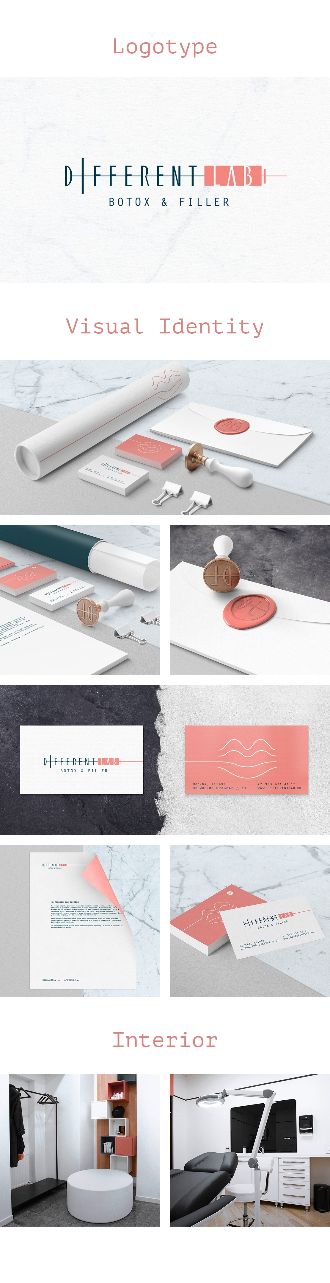
Brand Identity
Task
The task of the logo and corporate identity is to create in the eyes of potential consumers a unique image of the clinic, that fully corresponds to the brand values. In this case, on the one hand, to declare directly the main activity of the clinic, on the other hand, to separate from competitors who hide the essence of their work behind fancy images.
Ideas and solutions
Different Lab is a modern injectables clinic. The main feature of the clinic is that it does not hesitate to associate itself with the injections. On the contrary, Different Lab demonstrates by its work that "beauty injections" are a modern and affordable means to have a healthy skin color, clear face lines and attractive facial features, in one word - to look fabulous! Visual brand communication is built on this positioning. In the logo of the clinic name is enclosed in the image of the syringe. Clinic’s corporate colours are soft pink and deep blue. The first one is basic. It was suggested by us in order to evoke associations with nature, to soothe sharp and assertive nature of the logo. As an additional style-forming constant of corporate identity, we developed a line that turns into the outline of the lips. It is a logical continuation of the needle that is intended for being used in any communication channels including printed materials and advertising, social networks, and the website. Corporate colours are used in the interior of the clinic and they continue a single visual communication system. In combination with a friendly team of the highest level, the identity elements create the right mood for the Clients maintaining it during the entire visit. Different Lab turns the visit to a cosmetologist into a holiday. You will understand this as soon as you get there. Adress: Novinskiy blvr, 11, Moscow, Russia, 121099